Wanderlusting, with Juan Montoya & Celerie Kemble

Close friends intended to celebrate their shared June birthdays in Tel Aviv. Another couple planned their destination wedding last fall in Lisbon; their fingers are crossed for the rescheduled date this fall. And I had hoped to take my mother to Paris. Then COVID happened and plans were scuttled. Maybe you had a trip planned too?

But luxury problems aside, like many I’ve made the best of not being able to travel by immersing myself in books: fiction, non-fiction, and all-manner of books about design. And on the subject of design, there are two just-released standouts perfect for lock-down wanderlusting: Juan Montoya’s Designing Paradise, and Celerie Kemble’s Island Whimsey, both from Rizzoli New York.

………………..

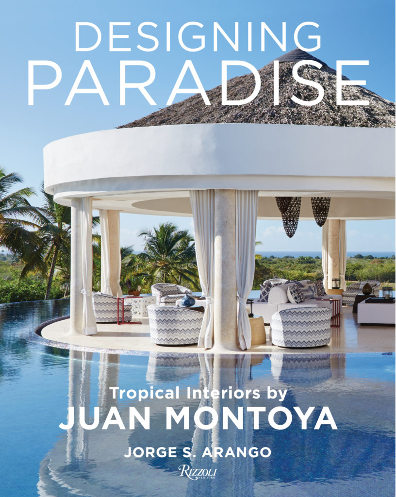
In Designing Paradise, we’re transported to Montoya-designed residences that occupy ravishing sites in Punta Mita in Mexico, Casa de Campo in the Dominican Republic, Miami Beach, Fisher Island, and other idyllic oceanfront locales. As much as these homes are escapist fantasias, they are also inextricably rooted to their geographic locations and their regional cultures.

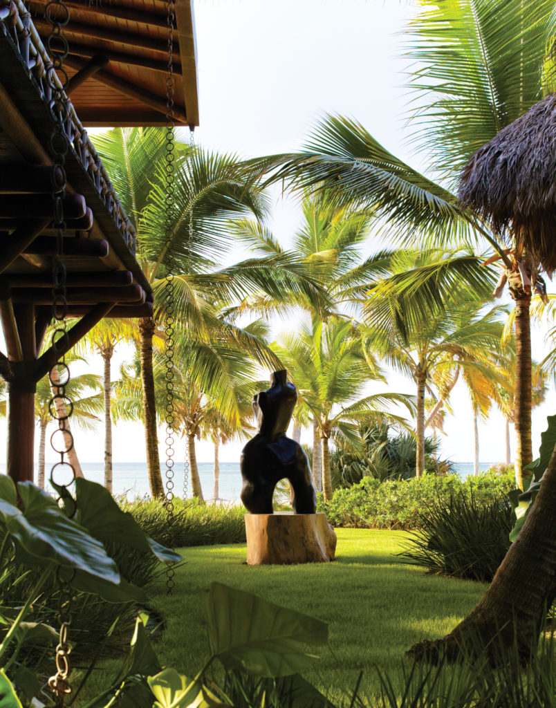
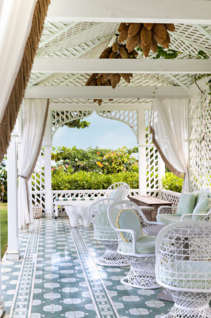
Open-air pavilions with endless views of sea and sand; sweeping terraces with glimmering pools and dramatic sunsets; sumptuous interiors with blue-and-white tiles, intricate beadwork, global textiles, and thatched roofs: these are just some of the details revealed in this envy-inducing volume.

………………..

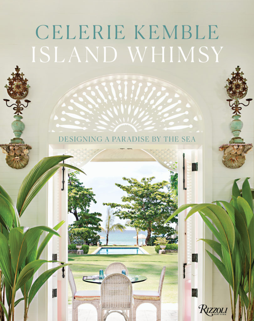
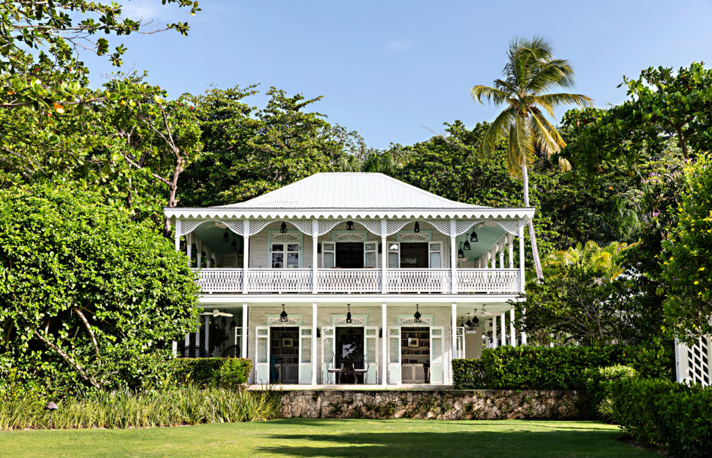
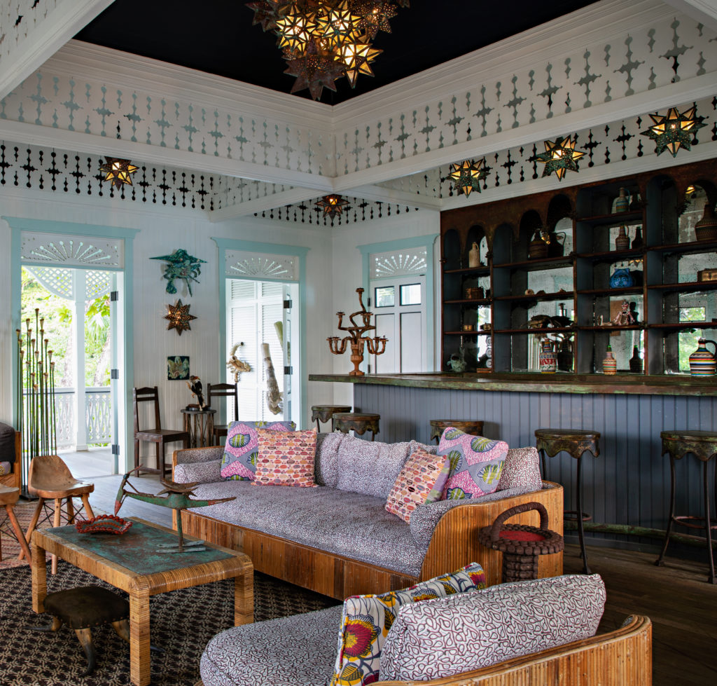
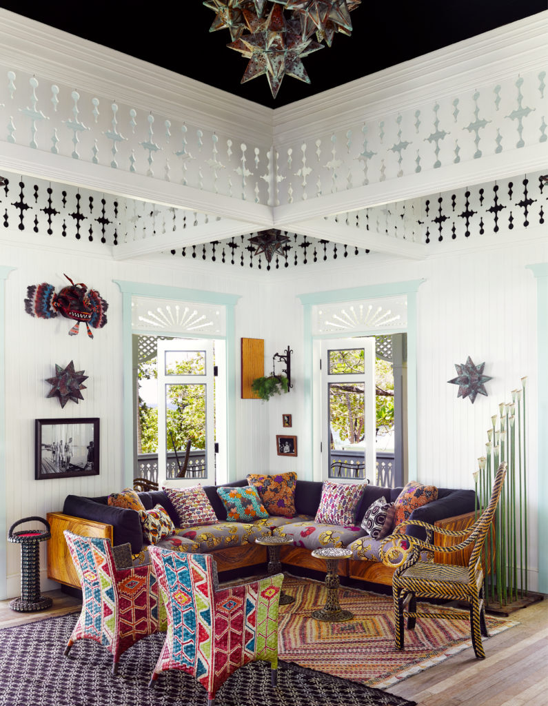
Island Whimsy chronicles how, in the summer of 2004, Celerie Kemble came upon on a wild swath of jungle in the Dominican Republic next to minty-blue water and an endless stretch of golden sand — and fell madly in love. Over the ensuing years she designed a home away from home there, an island retreat—a clubhouse and a grouping of family homes and guesthouses—suffused with light and air, full of indoor and outdoor rooms for relaxation. The book recounts Kemble’s deeply personal and creative journey designing Playa Grande and bringing this labor of love to life.

On the subject of travel, Mark Twain famously remarked, “Twenty years from now, you will be more disappointed by the things you didn’t do than by the ones you did. So throw off the bowlines. Sail away from the safe harbor. Catch the trade winds in your sails. Explore. Dream. Discover.”

And while travel may be curtailed as we ride out the pandemic, Montoya and Kemble, with their beautiful new tomes, offer the next best thing.

The Best Design Books of 2020

With a pandemic that’s forced us to more-or-less sequester at home for several months, you don’t need me to tell you it’s been a tumultuous year.

Under the circumstances, it’s no surprise that people have turned to their homes and gardens as sanctuaries in a storm – the psychic antidotes for the challenges of living through 2020. And this year’s finest design books – examining interiors, entertaining, and gardens – provide compelling inspiration as we turn the focus to our own corners of the world. Here are some of my favorites, in alphabetical order by author.

Continue reading “The Best Design Books of 2020”

Mario Buatta on Color

“Every color is potentially beautiful, provided one uses it in a fitting context and harmonious combination. The colors of the houses and apartments I’ve lived in and designed comprise an adventure into the myriad moods a full, bold spectrum has to offer. Color should be an expression of happiness.

While growing up, the only color I vividly remember was white—tinted with a dab of color—in every room of my parents’ house. The living room had a hint of pink; the dining room a tinge of tan, and on and on. My bedroom had a hint of blue and a Mondrian inspired rug in browns, tan, and cream that was there until my sixteenth birthday, when I was allowed to decorate the room to my liking. Rebellious as I had become at that point, I envisioned the interior of a barn, with dark brown walls, a cream ceiling, and the interior of my closet cherry red. The painter looked at my mother and said, “It will look like the inside of a barn.”

She agreed with him but let me do it anyway.

Grounding my bedroom with wall-to wall carpeting in hunter green and typical maple-wood furniture, I went on to furnish it with early American antiques, lighting, and objects. By the start of my twenties, I had filled my parents’ attic and basement with more of my finds. Eventually, I would get a grown-up apartment in New York City and experiment with many color and pattern combinations.

Looking back, my parents’ Art Deco style was not my taste. Their living room, tinted pink, had a chartreuse silk mohair velvet– covered chesterfield sofa with tan silk bullion fringe and two dark brown satin-covered square pillows in each corner. Tan and brown upholstered chairs sat on a rust-colored plush velvet carpet. The curtains, in a gold-and-brown Deco leaf weave, hung from steel poles with mirrored finials.

At age ten, I remember being wowed by the combination of blue, white, and yellow in my Aunt Lily’s kitchen. I asked my mother why we didn’t have those colors in our house, and she whispered, “Too Irish.”

Well, Irish or not, I’ve had that combination in my last two apartments.

The real turning point in my life happened when I was a student in Paris with the Parsons School of Design under the tutelage of Professor Stanley Barrows. During our earlier visits to the Postimpressionist painting galleries at the Musee d’Art Moderne in 1961, he exclaimed that if we didn’t understand the use of color as Henri Matisse, Pierre Bonnard, and Edouard Vuillard did, we would never make good decorators. I am grateful that I took the advice of Professor Barrows that day; it changed my outlook on using color in my career. I never forgot that lesson, and in later decades ColorField painters like Mark Rothko, Kenneth Noland, and so many others have carried the torch of using color in new and exciting ways.

My first apartment was an L-shaped sitting room–bedroom. I painted it all eggplant, right down to the crown moldings. The fabric at the windows was an English floral chintz I used in four later apartments against walls in banana yellow, silver tea paper, pistachio green, and pale blue. As it was windowless, I painted the kitchen off-white with a pale blue ceiling to bring in the sky, and the bathroom dark blue with a blue-and-white shower curtain featuring a zebra print and citron Turkish towels. The effect was a happy mix of nature’s colors.

In interior decoration, colors set the mood of a house and therefore require deep thought. I always advise clients to think of setting the entry in a color from nature, for example, pale blue for sky, pale green for a park vista, tans for the beach, or yellow for sunshine. Bringing the outdoors in can be a great success in city environs, whereas in the country, neutrals like grays or tans give relief to the bright mix of color in your garden.

Using these prescriptions, you then start moving from room to room applying different colors—none to be repeated!—making sure that they correspond to the way each room in the house or apartment is used. For example, paint a library or den a dark color such as brown, red, or hunter green to create a cozy setting. The same applies to a family room or upstairs sitting room. Make sure that colors proceed from nature’s neutrals to mood-changing tones that suit the various spaces.

There isn’t a shade or color I’ve ever seen that I haven’t liked. Sometimes I think I was born under a rainbow, but with no illusions of finding the proverbial pot of gold. Then again, the inspired and thoughtful interior designer, one who is willing to immerse him- or herself in the miraculous world of color, may find gold in a pot of paint.”

.

Rest in peace Mario. Your generosity toward me will never be forgotten

Architectural Digest: Autobiography of a Magazine, 1920-2010 by Paige Rense

It’s impossible to have a conversation about interior design in the 20th and early 21st centuries without acknowledging Paige Rense and her contribution in elevating the decorative arts during her legendary 35 year tenure as editor-in-chief of Architectural Digest.

Paige Rense

Now a new book by Rense, ARCHITECTURAL DIGEST: AUTOBIOGRAPHY OF A MAGAZINE, 1920-2010, chronicles the magazine’s humble beginnings as a regional Los Angeles based publication through the end of Rense’s tenure as the internationally respected authority on all things design.

The book is full of candid recollections, commentary, archival covers, and interior shots of the magazine, and also features the work of the world’s top architects and interior designers such as Mario Buatta, Philip Johnson, Tony Duquette, and Sally Sirkin Lewis, as well as the homes of celebrities like Truman Capote, Sonny & Cher, Elton John, Diane Keaton and Ralph Lauren.

Each chapter, written in the first person, is followed by illustrated anecdotes from Rense’s memories of past issues. As the editor who gave readers a glimpse into the most enviable homes around the world, Rense is uniquely qualified to tell the story of Architectural Digest.

In short: this book is a must for every well informed interior design library.

.

ARCHITECTURAL DIGEST: Autobiography of a Magazine: 1920 – 2010 By Paige Rense  Foreword by Mario Buatta

Rizzoli New York / October 2018

www.rizzoliusa.com

Preorder via Amazon.com

Kips Bay Decorator Show House 2018

Dan Fink Studio Kips Bay Decorator Showhouse 2018
Dan Fink Studio, photo credit Nickolas Sargent

A pair of double-faced silk portieres fabricated by the ladies at RoseHyll Studio separate Michael Herold’s patrician entry from Dan Fink’s deco-inflected ground floor landing at this year’s Kips Bay Decorator Showhouse. And yet the spaces flow together to set the tone for another banner year at this time-honored charity event on Manhattan’s Upper East Side.

Continue reading “Kips Bay Decorator Show House 2018”

Books: Ray Booth’s Evocative Interiors

Ray Booth Evocative Interiors Rizzoli

Interior designer Ray Booth’s work conjures comparisons: He understands the importance of silhouette like John Saladino; the precise tailoring of his rooms call to mind a Jill Sander collection; and his color sensibility inhabits the same etherial realm as a Turner seascape hanging at the Tate.

Quite the combination.

These ideas and more are evident in Ray’s masterful new book Evocative Interiors, released last month by Rizzoli New York.

Ray Booth Evocative Interiors Rizzoli

With a forward by Bobby McAlpine – whose firm Ray Booth is a partner in – Evocative Interiors features images from projects Booth has completely over the course of nearly two decades.

Ray Booth Evocative Interiors Rizzoli

.

“Our everyday surroundings are a mark we make to claim our place on earth.  The daily experiences they evoke through the combination of color, material, furnishings, and context profoundly affect our physical and emotional well-being.” – Ray Booth

.

Ray Booth Evocative Interiors Rizzoli

Booth creates rooms meant for living – opulent and photogenic to be sure — but with a soul that portends an invitation to sit, relax, converse, and enjoy. These are rooms best categorized as supremely modern; they address our movement toward cleaner eclecticism and restorative spaces.

Evocative Interiors Ray Booth Rizzoli Books

Ray Booth Evocative Interiors Rizzoli

When I put this book down after a careful appraisal, I remembered the outspoken Polly Mellen in that scene from Unzipped where she’s in the back seat of a limousine with Isaac Mizrahi, describing his work as sublime but not fussy; in a wide-eyed moment she exclaims “Fussy — Finished!”

Sublime but not fussy aptly describes Ray Booth’s work as well.

By Ray Booth
Rizzoli New York  2018

Books: Kathryn Scott’s ‘Creating Beauty’

Kathryn Scott Creating Beauty

I heard Brooklyn-based interior designer Kathryn Scott speak at the AD Home Show several years ago and was captivated by the way she articulated herself, and by her personal style, unique among her contemporaries in the design industry. But it was the slide show of images of her Italianate townhouse that left me speechless – indeed a rare feat for those who know me well.

Taking the opportunity to introduce myself after the panel discussion led to a visit to Kathryn’s home…

Continue reading “Books: Kathryn Scott’s ‘Creating Beauty’”

(VIDEO) Navigating the New World of Design Media

Last Wednesday, the New York School of Interior Design hosted Galerie Magazine editor in chief and honorary dean of the SCAD School of Building Arts, Margaret Russell, and me for a spirited conversation about navigating the new world of design media. We discussed shelter publications, designer websites, social media (including an excellent tutorial on utilizing Instagram as a business tool), as well as interior design book publishing.

If you were unable to attend, here is a videotape of the evening provided by NYSID. It’s an invaluable opportunity to hear one of the most important minds in the design industry share her insights.
.

Content Connectivity

Back in February 2015, the marketing guru Seth Godin published an article on one of my favorite blogs, Contently.com, suggesting, “You Need Editors, Not Brand Managers.” It changed the way I think about marketing and promotion.

The take-away from the article, simply stated, is that we’re living through a revolutionary moment in the way we communicate with each other, share news and information and promote products and services. Social media has upended our reliance on print and television, and offers opportunities for both individuals and brands to advance their goals by developing and disseminating content with relative ease.

The secret to using these new tools successfully, according to Godin, is to develop content that connects with your audience, the people who might become your customers.

In my work as a consultant, I strive to help my clients make these connections. When working with designers, I spend time helping them better understand their brand and their potential customers. This is often simply a matter of “aesthetic forensics”—examining what their work represents and whom it might reach.

Let me give you an example I share with prospective clients who are interior designers.

Imagine you have a keen interest in placing art in interior design; to be more specific, let’s say you love 20th-century works on paper. Presumably, these kinds of works appear in rooms you’ve designed, and feature prominently in your portfolio.

Here’s what I might recommend: research all the auctions, gallery shows, and museum exhibitions over the next 12 months that include works on paper, and make a plan to attend as many as possible. Here’s when the content development becomes important.

If you’ve established an industry blog, I would recommend that you write and publish a review of each event you attend. In that way, you’re telling an organic story of your interest in works on paper to anyone who researches you online. Ideally, your review should include photographs you’ve shot at the event, images of your favorite pieces from the show, and a photograph of yourself in the space.

One important auction on the calendar in New York this spring is Sotheby’s photographs by Ansel Adams. This would be a perfect choice for several reasons. First, Christie’s has 445,000 followers on Facebook, nearly 91,000 followers on Twitter and more than 500,000 followers on Instagram. Second, it’s likely that if you promote Christie’s auction on those three platforms, they’ll return the favor by promoting your content free of charge.

And who are the people who follow Sotheby’s? Many of them are your potential customers, with a strong interest in photography. If they land on your blog to read your review of the Adams auction, they may choose to browse through your design portfolio as well, and appreciate your use of works on paper. Through this shared interest, you may gain a new customer. That’s what I refer to as “Content Connectivity”.

Now, a bit about how to craft content that not only connects with your audience, but also inspires them to share it.

Here I have a catchphrase: “be of service” to your audience. In other words, create content that enriches the lives of your audience and the larger community by offering a bit of your expertise. This is where I’ve been known to say, “Your ego is not your amigo.” Talking about yourself incessantly turns people off; like a bore at a dinner party, people eventually stop hearing you. Make your content about your audience, not about you.

So, how can you be of service to your audience? I have a four-point strategy: educate, solve, promote, and entertain.

Taking the Ansel Adams auction as an example, you might;

  • Educate your audience. Share a bit of biographical information about Adams and his career in photography. Perhaps place him in the context of the art of the American Southwest, and explore his relationships with other artists such as Orville Cox, Georgia O’Keeffe, and Edward Curtis.
  • Take the opportunity to solve a problem. As the works in the Christie’s auction are large-scale, you might choose to offer your expertise on how to best hang large-scale artworks, or how to best incorporate black-and-white photography into a color scheme.
  • Promote something of value. Review the auction lots in advance if you can gain access to the sale preview. Because you’ve had experience with placing Adams’ work before, you might find a special photograph that’s got a low estimate, a rare image, or something iconic that’s not often seen at auction.
  • Entertain. Tell a story. We all have a wealth of history to draw upon; take the opportunity to share an anecdote about your first experience with an Ansel Adams work. Perhaps you were in design school and traveled to MoMA, where you first saw his work in person. Write about that experience.

Let me sum it up for you. When I think about the importance of crafting branded content and sharing it across social platforms, I’m reminded of a designer I met with a few years ago who said “I don’t need to be on social media; I don’t really care about what my friends are having to eat.”  And on some level, I understood his reluctance. But carefully considered and well-crafted content could connect you with a client, and that might pay for your lunch.