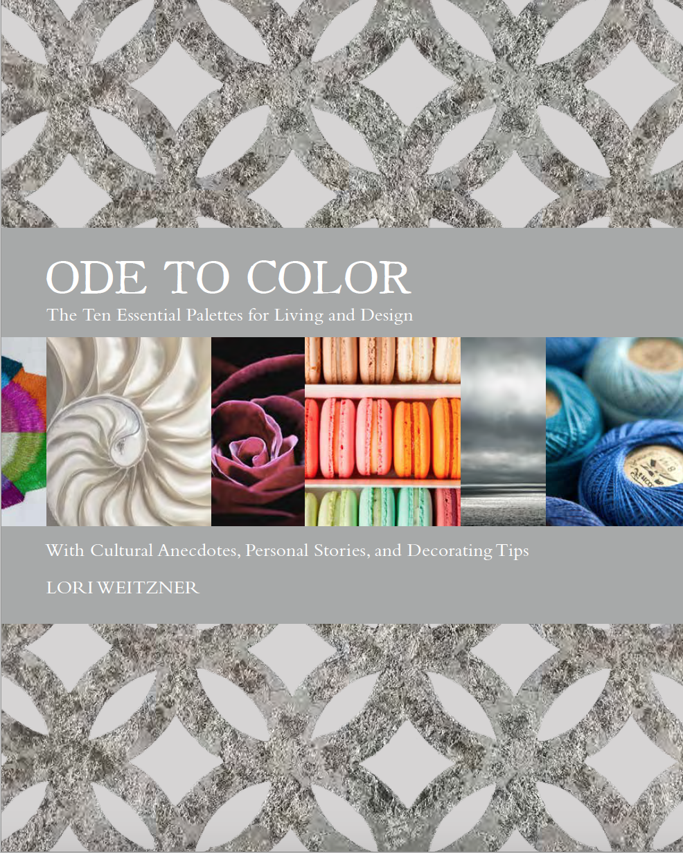
In keeping with this blog’s focus on education, it’s my plan to write about anything and everything that advances an understanding of design. And what better place to start than with a great book on color?
Textile designer Lori Weitzner’s Ode To Color (Harper Design) is just such a volume. I’ve had the privilege of getting an advance copy, and can enthusiastically say that Lori’s approach to the subject is beyond the basics of the color wheel. Some of the words that come to mind? Sophisticated, romantic, nuanced and poetic. It’s a treasured glimpse into Lori’s thought process, linking her understanding of color to her textiles and wall coverings.
I had the opportunity to talk with Lori about the project. Thought I’d share the conversation…
CD: Before I commence with the questions, let me say how truly inspirational Ode To Color is. When and why did you first conceive of the idea for the book?
LW: I had wanted to create a book for a very long time. At least for fifteen years I had various concepts and would periodically pitch them to multiple book publishers – always to be rejected.
Then about two years ago I felt ready to propose a new idea – on where I get my inspiration. And so I put together a book proposal, even hiring a graphic designer to create some chic looking book spreads to go with the proposal. Then a friend kindly made an introduction to an editor at HarperCollins – one she felt could give me some advice. And so I went to see her. This editor spent a few hours with me in her office (a day I will never forget) and then she asked to visit my studio. By the end of the studio visit, she said that she wanted to do a book with me! I was shocked and elated. However, it was not the book I was proposing. She felt the idea I proposed was based on what I thought people wanted to read – and not a book about what I really wanted to say.
She was right.
In a way, she gave me the permission I needed to explore and go more personal – and that is how I came up with the concept of my ten color worlds. As much as I am a textile designer, color for me has always been the driving force behind everything I do, feel and experience. And from that point on it was about how to find the best way to express these intimate worlds in the form of a book.
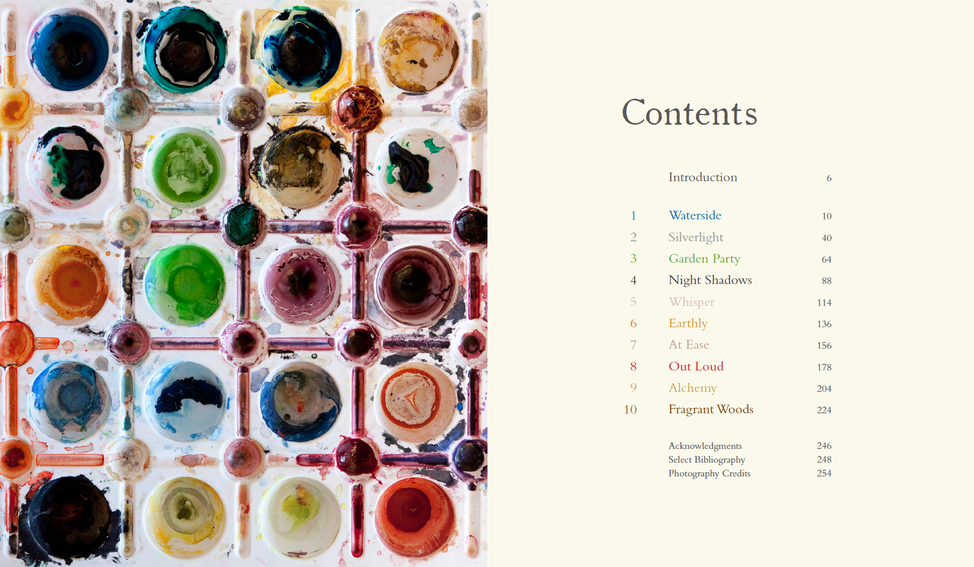
CD: And on that subject, in your introduction to the book you explain the concept of “Color Worlds”, more specifically the ten you find most compelling. What was the process of arriving at these concepts?
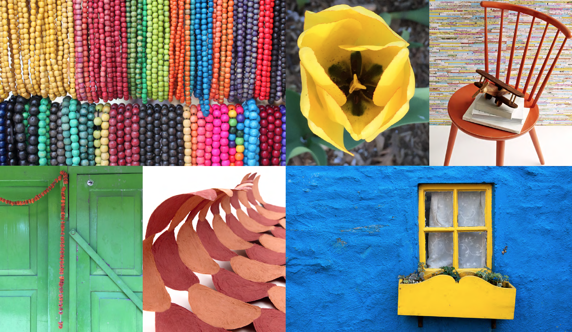
LW: I began by buying a large box. I remember standing for an hour in the store debating which color box to buy before finally settling on purple. Then I brought it to my studio and as it sat open on my art table for about a month, I began gathering things that were around me that inspired me and threw them in the box. Swatches, yarns made of all kinds of fibers, quotes, poems, sea shells, sea glass, jewelry, crystals, photos, artwork.
Eventually these items began to find their own way into particular color categories. And so it began. From this came the ten featured in my book because they are the most prominent in my work; they are the ones that have stood the test of time.
They are personal to me, to my processes as an artist and to my life experiences. They are the primary threads in my tapestry as they correspond to the many gears we all move through in the course of our lives: work, reflection, rest, levity and love. What connects these color worlds is a level of engagement — they speak to the senses on an emotional plane, influencing moods and jogging memory, and simply reflecting who we are.
CD: Mario Buatta examines the subject of “Color” in my book, and suggests that his study of Post Impressionist paintings at the Musée d’Art Moderne in Paris in the 1960’s — artists like Pierre Bonnard, Henri Matisse, and Édouard Vuillard — transformed his understanding of color. How big a part does fine art play in your conception of color?
LW: I thoroughly enjoyed reading Mario Buatta’s essay in your book –especially when he says “There isn’t a shade or color I’ve ever seen that I haven’t liked.” I would agree with him wholeheartedly.
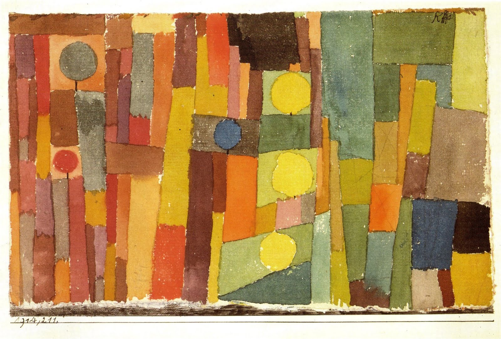
Fine art has often played a big part in my conception of color as well. In fact, originally I was a painting major at Syracuse University until my professor suggested (not subtly) that I was not good enough to make a living as a painter and should change my major to textile design because I “had a good sense of color and composition.” Like Mario, I coveted the Post-Impressionists especially in how complex the colors actually were once studied. There was no such thing as simply red, blue, green — these colors I soon understood were much more nuanced, much more complex. Perhaps if I had to say who inspired me the most however with regard to color, it would have to be Paul Klee. His colors and color combinations, so unexpected and unable to be easily named, are extraordinary.
CJ: Other than fine art, what are some of your other important sources of color inspirations?
LW: Certainly nature is the biggest one for me. How can it not be? Nature in all its glory: foliage, blooms, sky, earth, gems, rocks, sand, water, animals, sea life. I can go on forever here…
.
“This book — while it contains many interior design ideas and explores color from a cultural, religious, and social point of view — is foremost a journey through these distinct color worlds, each with its many powers, moods and associations”
Lori Weitzner
.
CD: One of the things I appreciate most about your book is that above and beyond color-wheel theory, it examines the cultural, historical, religious, and secular connections that color makes in our daily lives. Have you alway had such a holistic approach, or did it develop over time?
LW: I think from a very early age I was aware of the fact that I could “experience” color. Some may call it synesthesia — the idea that all the senses combine in order to experience something. For me color was always a multidimensional experience: I can taste blue, hear the sounds of orange, make connections between colors and memories, emotions and stories. I believe we all have this ability but learn at a young age to separate our senses. In my essay entitled “Do You See What I Taste” in the chapter “Waterside”, I talk more about this phenomenon.
CD: Speaking of essays, in his piece on “America” in Interior Design Master Class, Jeffrey Bilhuber remarks that the British have a “brazen competency” with color. Perhaps you agree. But I wonder, who among your contemporaries in the American design community would you applaud for their color sensibilities?
LW: I had a chuckle when I read that quote by Jeffrey Bilhuber. My husband is British and we spend a lot of time in the UK and to be honest, I often feel a bit out of sorts with the heaviness and absoluteness (is that a word?) of color that I find common there. I think Jeffrey is right in general and that Americans don’t have the history to limit us which I see as a great advantage. There is a certain freedom in that.
There are so many American designers that I admire for their color sense it is hard to name favorites. But as I study your book, I cannot help but notice how it isn’t just one type of colored interior that resonates for me, but more how the designer mixes the colors together in a space. They are the true experts in how to create a mood.
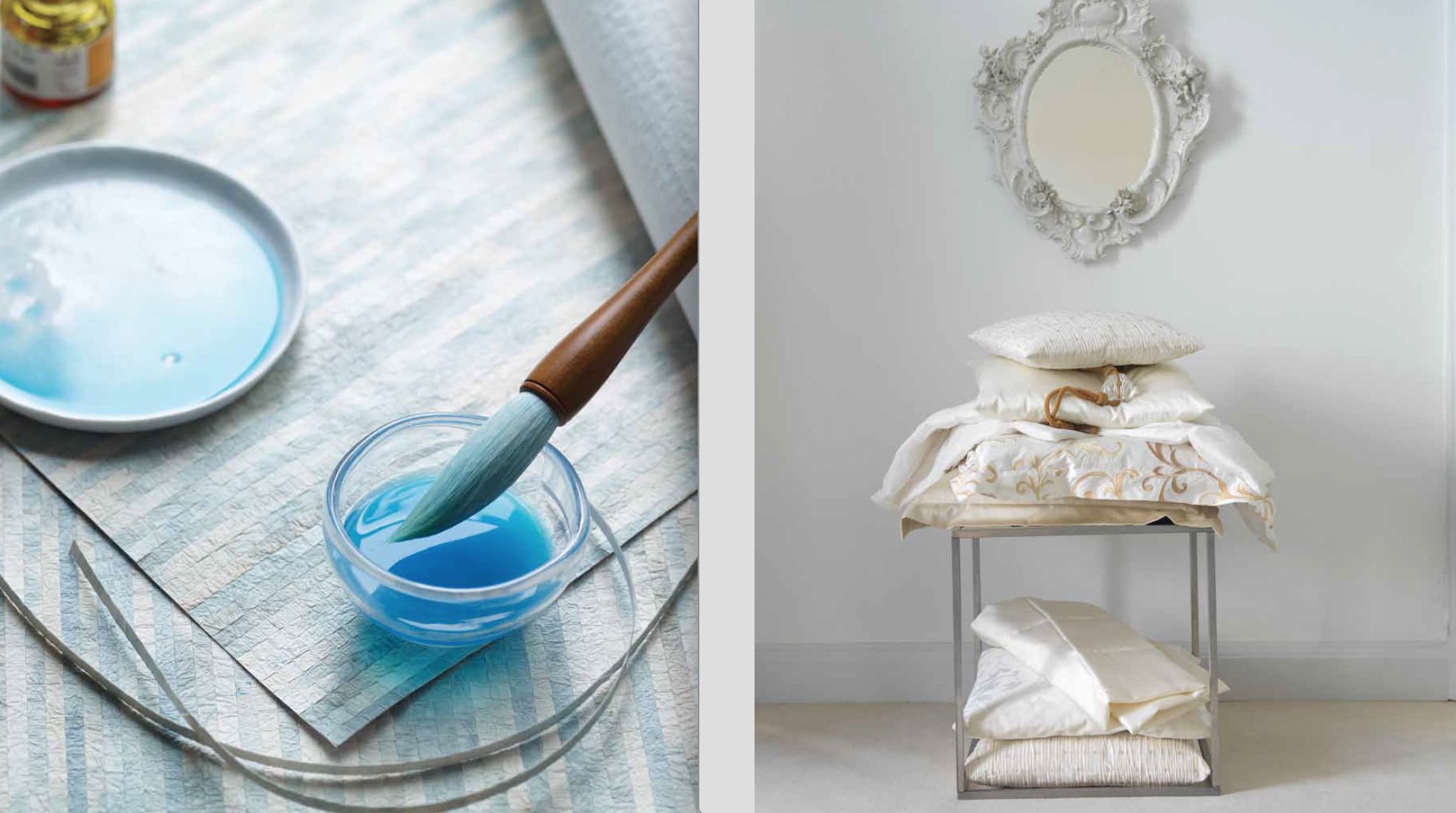
CD: After carefully reading Ode To Color, I’ve come to the conclusion that I’m really quite bi-coastal, living between ‘Waterside’ and ‘Whisper’. What does that say about me?
LW: Okay Carl! You asked so here we go! You are one of my first psychic color readings to be published!
You are one of the most dependable of friends. Loyal and steady and honest. You care to the point that it even hurts sometimes. You always tell the truth, even when it is not to your advantage. Your promises are always upheld. You are very sensitive but package it up in a strong skin. You long for being more calm and at peace inside, and are always working on that aspect of yourself. Sometimes you think you have failed – but don’t. Ever. It is a process. Be patient with yourself. Anyone who can call you a friend is a very fortunate person. Too many Whisper colors in your life will unground you. You need a combination of both Whisper to elevate your inner self and Waterside to feel secure and stable.
CD: THANK YOU!
And finally, imagine yourself speaking to an auditorium filled with the most enthusiastic design students. How would you suggest they best proceed in understanding the use of color in their work?
LW: I would encourage students to begin to use color as its own language. Color can be the initial inspiration for all designs and the guiding star throughout the design process. I have very particular notions of colors, their characters and impact and associations, both alone and in groups. Color can inform our aesthetic, consciously and subconsciously.
There is no set formula when it comes to developing a color world; it is not a science, but a process that is both intuitive and practical. Some of these worlds are the result of a deliberate attempt to conjure a certain mood, memory, place, or emotion. Others I developed, or discovered, as I worked through color selections for my designs. Whichever way it evolves, give color it’s deserved voice.
………………..
Ode To Color is available as of today, December 6th. Here’s the link to purchase the book (which would make an excellent gift for the design enthusiast on your list!) And congratulations Lori!
