On Style: An Introduction

When talking about design, some critics say, “We have seen everything before. There’s really nothing new being created.” On a granular level, I’m inclined to agree.  

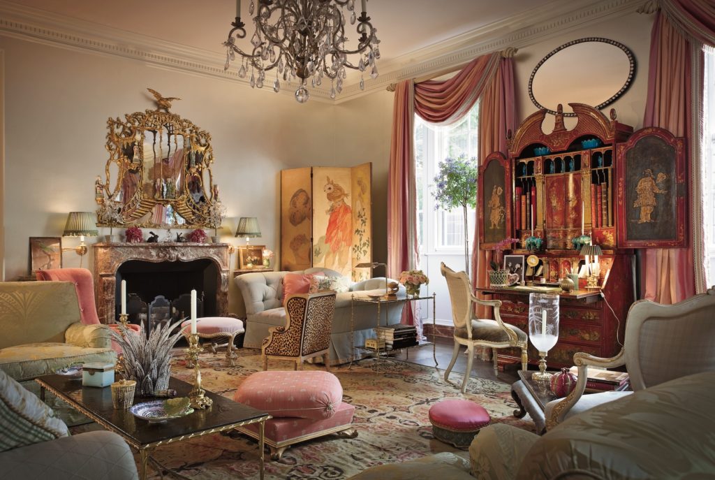
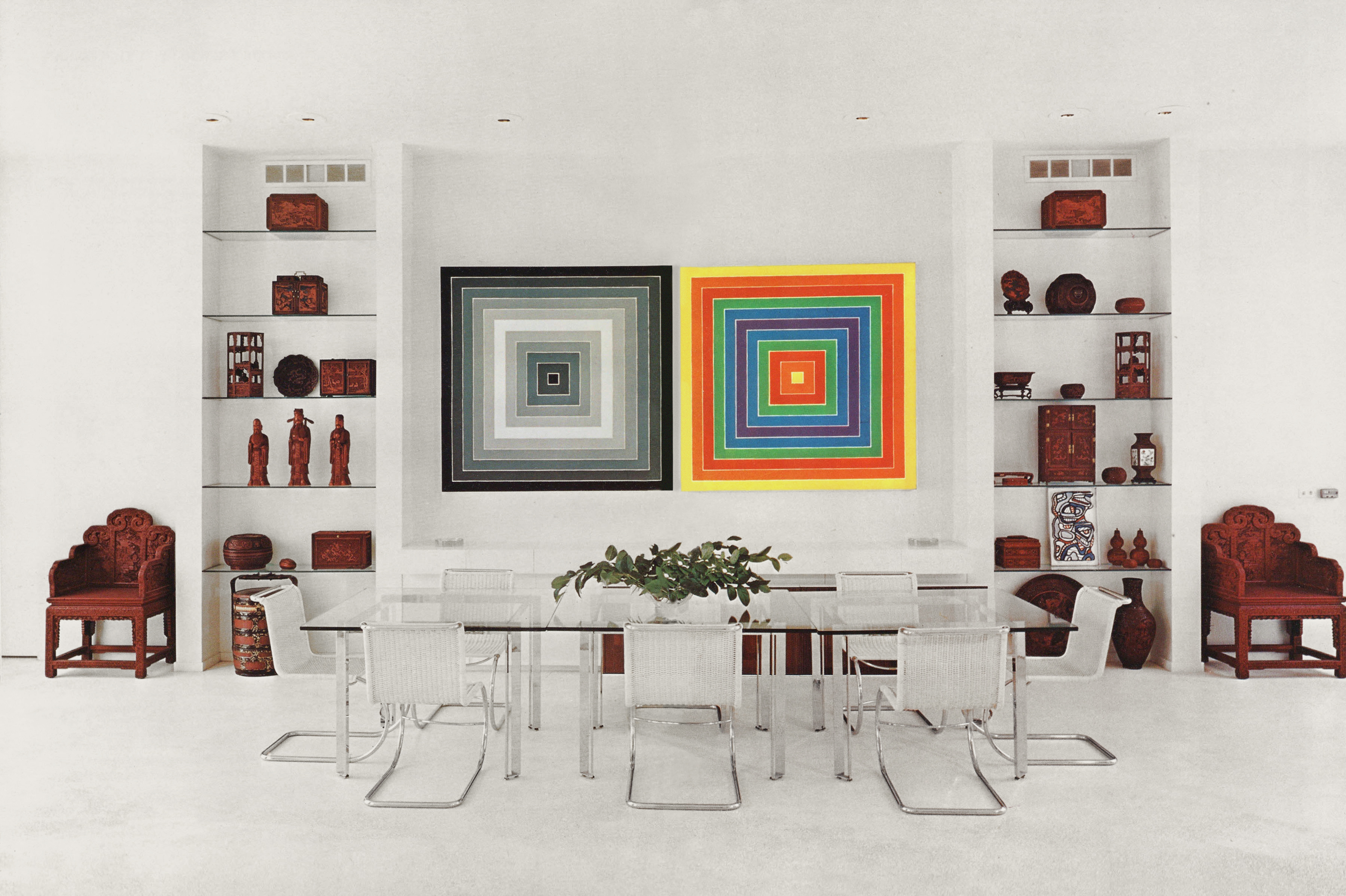
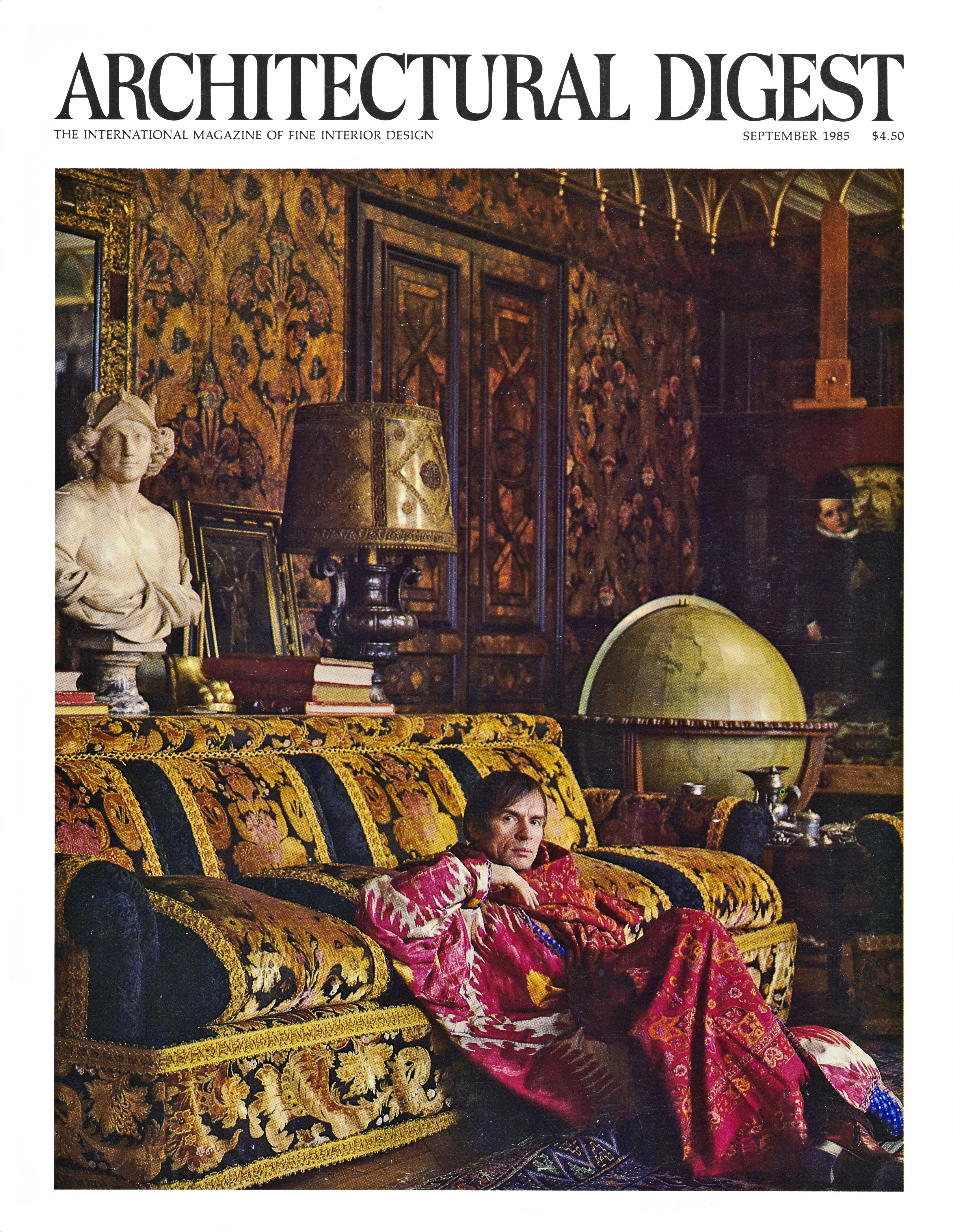
But interior design has always been defined by its moment in time, generational movements that are, in turn, shaped by culture, economics, and fashion. For example, in the 1970s industrial minimalism was au courant. In the early 1980s, many decorators were putting their own spin on British or French design. Concurrently, other designers created rooms that celebrated juxtaposition: Lucite with floral chintz; streamlined Parsons tables with eighteenth-century Irish chairs. This set the stage for the eclecticism of the high-flying 1990s.  

The rise of the Internet at the turn of the twenty-first century provided a proliferation of visual information to drive the eclectic movement still further. Glorious Moroccan color palettes, sleek mid-century Italian silhouettes, and the patina associated with Japanese wabi-sabi are just a few of the ideas designers freely incorporated into their work. With so many concepts in the mix, interior design increasingly became reflective of a global view.  

That brings me to this book.  

In choosing fifty designers who represent the next generation of interior design, I began by doing research. Who has great style? Who has something visually interesting to say? Who is moving the discipline forward?  

As I sifted through the finalists, I found that there was no one style of design that captured today’s moment. Instead, in what feels like a natural progression from eclecticism, there is a proliferation of aesthetic diversity. Words like contemporary or classic feel too limiting. We need a broader vocabulary to describe design today. Among the designers featured in this book, there are the New Traditionalists, who pay homage to classic design while responding to societal changes; the Modern Minimalists, who seek to create sanctuary to balance frenetic lives; the Saturated Colorists that conjure new palettes; the Casual Bohemians, who mix humble furnishings in exciting ways; and devotees of masculine restraint and urban chic.  

Now, make no mistake: interior design’s function will always be to provide a personal backdrop for the business of living, and Louis Sullivan’s famous “form follows function” edict remains prescient. But there’s a new freedom in interior design. We may have seen it all before, but the variety of aesthetic lenses through which designers see interiors is expanding exponentially and in tandem with the technological advances of the twenty-first century.  

As you read the profiles of the fifty designers included in this book, with their thoughts on their influences and inspiration, color and key elements, it’s my sincere hope that their answers, in concert with stylish images of their work, will inspire and delight you. Because in the end, isn’t that what great design is all about? 

Mario Buatta on Color

“Every color is potentially beautiful, provided one uses it in a fitting context and harmonious combination. The colors of the houses and apartments I’ve lived in and designed comprise an adventure into the myriad moods a full, bold spectrum has to offer. Color should be an expression of happiness.

While growing up, the only color I vividly remember was white—tinted with a dab of color—in every room of my parents’ house. The living room had a hint of pink; the dining room a tinge of tan, and on and on. My bedroom had a hint of blue and a Mondrian inspired rug in browns, tan, and cream that was there until my sixteenth birthday, when I was allowed to decorate the room to my liking. Rebellious as I had become at that point, I envisioned the interior of a barn, with dark brown walls, a cream ceiling, and the interior of my closet cherry red. The painter looked at my mother and said, “It will look like the inside of a barn.”

She agreed with him but let me do it anyway.

Grounding my bedroom with wall-to wall carpeting in hunter green and typical maple-wood furniture, I went on to furnish it with early American antiques, lighting, and objects. By the start of my twenties, I had filled my parents’ attic and basement with more of my finds. Eventually, I would get a grown-up apartment in New York City and experiment with many color and pattern combinations.

Looking back, my parents’ Art Deco style was not my taste. Their living room, tinted pink, had a chartreuse silk mohair velvet– covered chesterfield sofa with tan silk bullion fringe and two dark brown satin-covered square pillows in each corner. Tan and brown upholstered chairs sat on a rust-colored plush velvet carpet. The curtains, in a gold-and-brown Deco leaf weave, hung from steel poles with mirrored finials.

At age ten, I remember being wowed by the combination of blue, white, and yellow in my Aunt Lily’s kitchen. I asked my mother why we didn’t have those colors in our house, and she whispered, “Too Irish.”

Well, Irish or not, I’ve had that combination in my last two apartments.

The real turning point in my life happened when I was a student in Paris with the Parsons School of Design under the tutelage of Professor Stanley Barrows. During our earlier visits to the Postimpressionist painting galleries at the Musee d’Art Moderne in 1961, he exclaimed that if we didn’t understand the use of color as Henri Matisse, Pierre Bonnard, and Edouard Vuillard did, we would never make good decorators. I am grateful that I took the advice of Professor Barrows that day; it changed my outlook on using color in my career. I never forgot that lesson, and in later decades ColorField painters like Mark Rothko, Kenneth Noland, and so many others have carried the torch of using color in new and exciting ways.

My first apartment was an L-shaped sitting room–bedroom. I painted it all eggplant, right down to the crown moldings. The fabric at the windows was an English floral chintz I used in four later apartments against walls in banana yellow, silver tea paper, pistachio green, and pale blue. As it was windowless, I painted the kitchen off-white with a pale blue ceiling to bring in the sky, and the bathroom dark blue with a blue-and-white shower curtain featuring a zebra print and citron Turkish towels. The effect was a happy mix of nature’s colors.

In interior decoration, colors set the mood of a house and therefore require deep thought. I always advise clients to think of setting the entry in a color from nature, for example, pale blue for sky, pale green for a park vista, tans for the beach, or yellow for sunshine. Bringing the outdoors in can be a great success in city environs, whereas in the country, neutrals like grays or tans give relief to the bright mix of color in your garden.

Using these prescriptions, you then start moving from room to room applying different colors—none to be repeated!—making sure that they correspond to the way each room in the house or apartment is used. For example, paint a library or den a dark color such as brown, red, or hunter green to create a cozy setting. The same applies to a family room or upstairs sitting room. Make sure that colors proceed from nature’s neutrals to mood-changing tones that suit the various spaces.

There isn’t a shade or color I’ve ever seen that I haven’t liked. Sometimes I think I was born under a rainbow, but with no illusions of finding the proverbial pot of gold. Then again, the inspired and thoughtful interior designer, one who is willing to immerse him- or herself in the miraculous world of color, may find gold in a pot of paint.”

.

Rest in peace Mario. Your generosity toward me will never be forgotten

Architectural Digest: Autobiography of a Magazine, 1920-2010 by Paige Rense

It’s impossible to have a conversation about interior design in the 20th and early 21st centuries without acknowledging Paige Rense and her contribution in elevating the decorative arts during her legendary 35 year tenure as editor-in-chief of Architectural Digest.

Paige Rense

Now a new book by Rense, ARCHITECTURAL DIGEST: AUTOBIOGRAPHY OF A MAGAZINE, 1920-2010, chronicles the magazine’s humble beginnings as a regional Los Angeles based publication through the end of Rense’s tenure as the internationally respected authority on all things design.

The book is full of candid recollections, commentary, archival covers, and interior shots of the magazine, and also features the work of the world’s top architects and interior designers such as Mario Buatta, Philip Johnson, Tony Duquette, and Sally Sirkin Lewis, as well as the homes of celebrities like Truman Capote, Sonny & Cher, Elton John, Diane Keaton and Ralph Lauren.

Each chapter, written in the first person, is followed by illustrated anecdotes from Rense’s memories of past issues. As the editor who gave readers a glimpse into the most enviable homes around the world, Rense is uniquely qualified to tell the story of Architectural Digest.

In short: this book is a must for every well informed interior design library.

.

ARCHITECTURAL DIGEST: Autobiography of a Magazine: 1920 – 2010 By Paige Rense  Foreword by Mario Buatta

Rizzoli New York / October 2018

www.rizzoliusa.com

Preorder via Amazon.com